Australia battles bush fires every year, but recent fires have caused incomparable widespread devastation with millions of acres of land affected and about half a billion animal deaths according to some estimates. Number of houses engulfed in these flames have turned to ashes and more than 20 people have lost their lives so far. Even though there has been some rains in fire-ravaged parts of Australia, it has caused only momentary temperature drop. Officials have warned that there is a high possibility of flames to take off again.
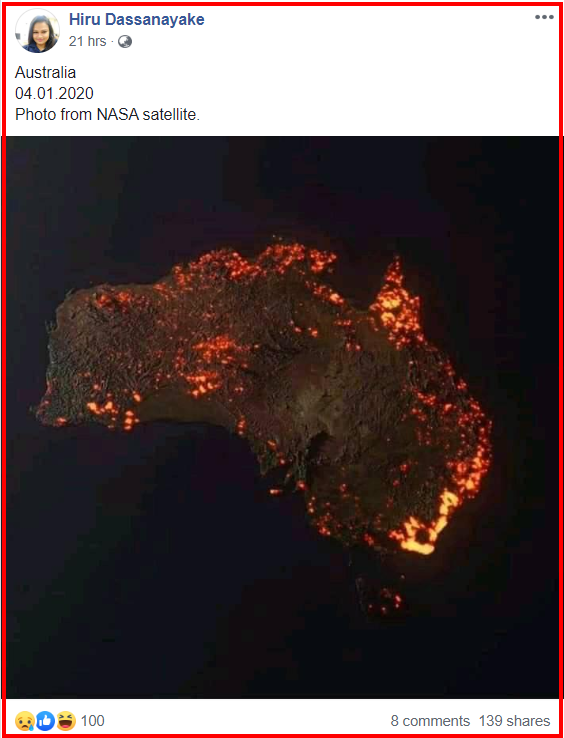
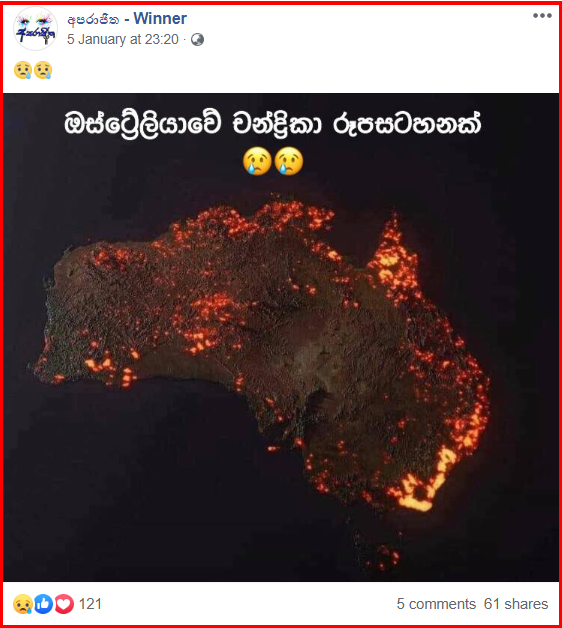
In this backdrop, a number of images claimed to be satellite images displaying the devastation caused by fire from Australia are shared widely. We noticed that many Sri Lankans on social media shared the image, given below, as a NASA satellite image.
| Facebook Link | Archived Link |
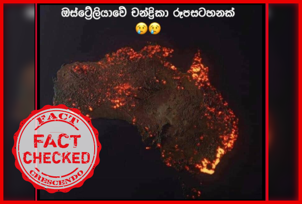
Same image was shared with similar narrative in Sinhala claiming “ඕස්ට්රේලියාවේ චන්ද්රිකා රුපසටහනක්” translating to “Satellite image of Australia”
| Facebook Link | Archived Link |
We noticed a number of comments to these posts stating that this is a misinterpretation as well; hence, we decided to carry out a fact check.
Fact Check
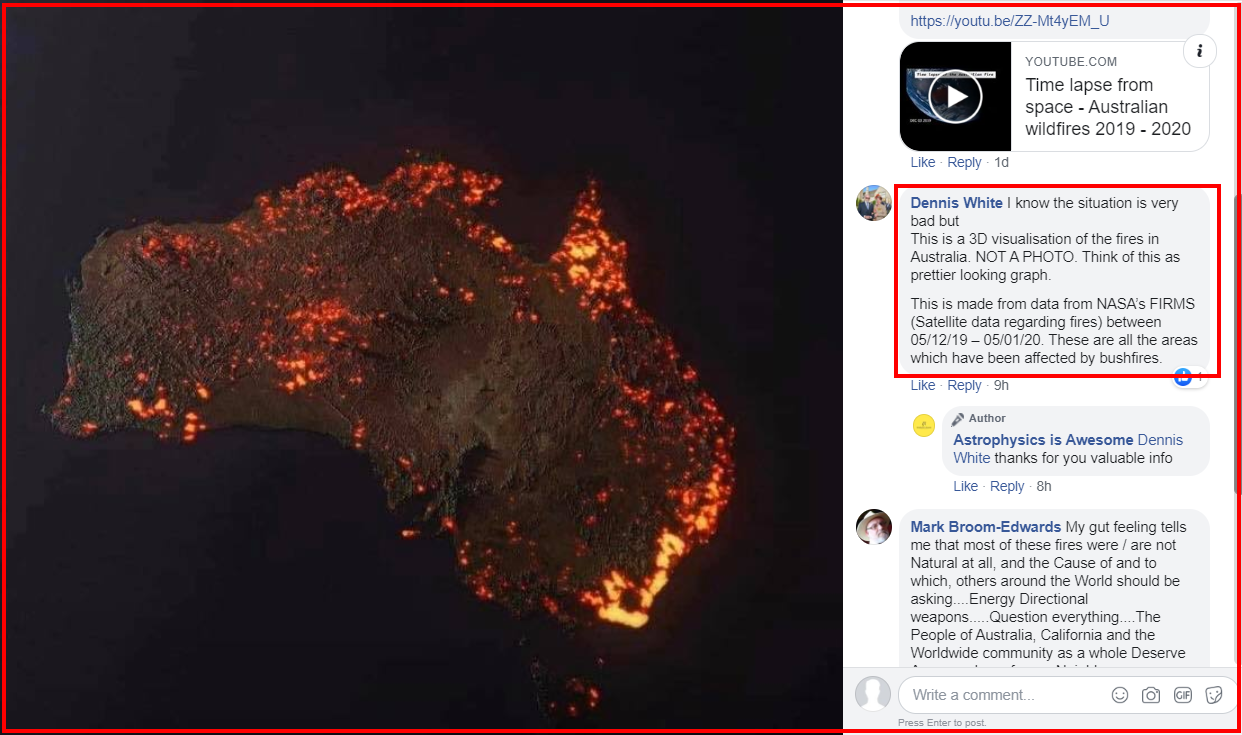
We initially searched for other posts on social media where this image was being used and came across the following post from a page called “ Astrophysics is Awesome” with the caption “3D visualization of wildfires in Australia by NASA satellites 😔💔”
| Facebook Link | Archived Link |
According to the comment to this post, “This (the image) is a 3D visualisation of the fires in Australia. NOT A PHOTO. Think of this as prettier looking graph.
This is made from NASA’s FIRMS data (Satellite data regarding fires) between 05/12/19 – 05/01/20. These are all the areas which have been affected by bushfires”
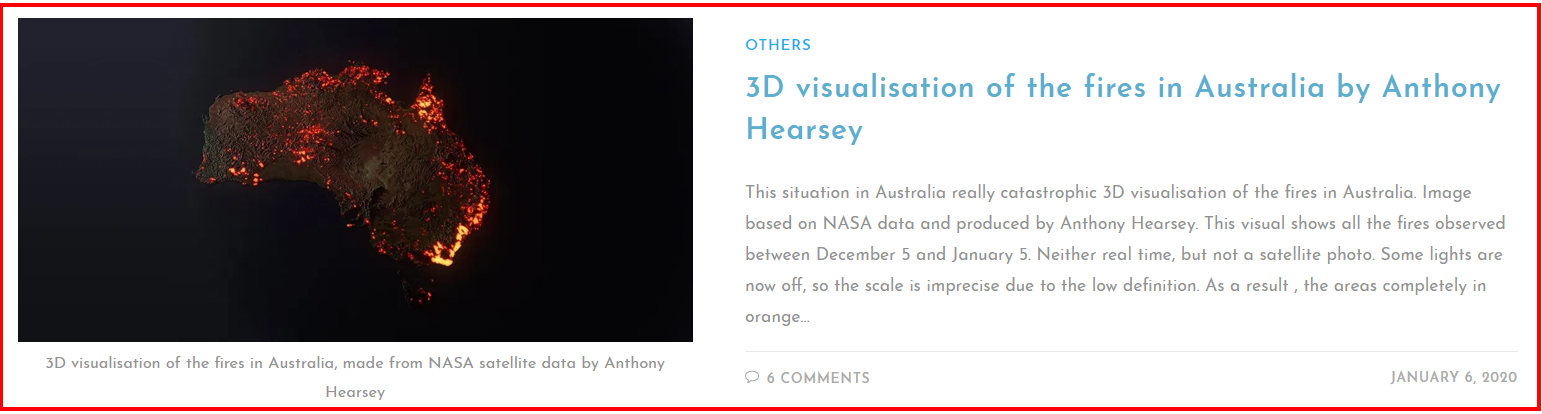
After doing a simple image search we were came across a few articles, which carried a narrative about the claimed image. In a blog by Samir Belhamara we noticed an article titled “3D visualisation of the fires in Australia by Anthony Hearsey” for the same image as below.
| Article Link | Archived Link |
A reddit post had also carried a similar article mentioning this is a ““3D “visualisation” of the fires in Australia, made from NASA satellite data. These are all the areas which have been affected, but not all the areas are still burning.” 📸 Credit ~ Anthony Hearsey – Creative Imaging”
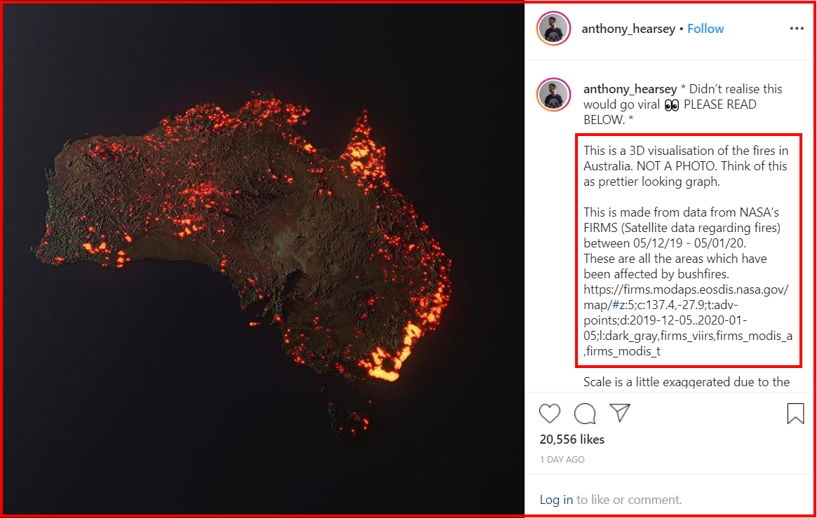
Hence, we checked the social profiles of Anthony Hearsey, who is credited to be the creator of this 3D Visualization. We found the same image posted on his Instagram account with the caption “Didn’t realise this would go viral 👀 PLEASE READ BELOW. This is a 3D visualisation of the fires in Australia. NOT A PHOTO. Think of this as prettier looking graph. This is made from data from NASA’s FIRMS (Satellite data regarding fires) between 05/12/19 – 05/01/20.These are all the areas which have been affected by bushfires…”
Instagram Post by Anthony Hearsey
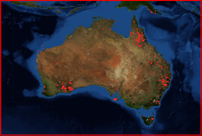
We went on to check the NASA data of Fire Maps across the globe using FIRMS (Fire Information for Resource Management System) and we able to find the archived fire related data which Anthony Hearsey had used to model his 3D visualization. Below is a snapshot of the active fire maps of Australia as per NASA satellites. (Last Updated: 2020-01-07 01:24 GMT)
Conclusion:
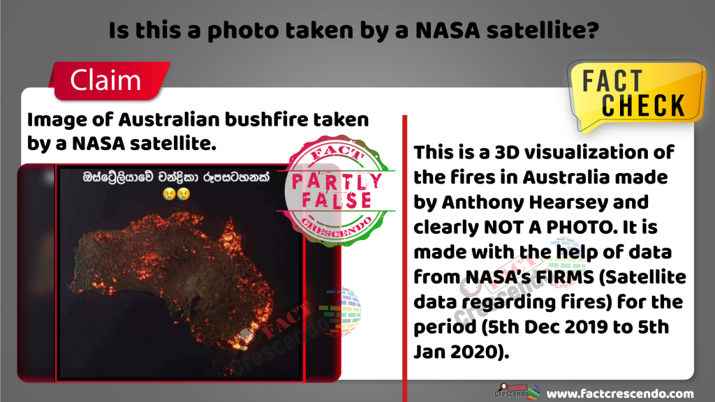
This is a 3D visualization of the fires in Australia done made by Anthony
Hearsey (image maker who specializes in retouching and creative imaging) and clearly NOT A PHOTO. It is made from with the help of data from NASA’s FIRMS (Satellite data regarding fires) for a the month period (5th Dec 2019 to 5th Jan 2020).

Title:Is this a photo taken by a NASA satellite?
Fact Check By: Sathyajith SubasingheResult: Partly False